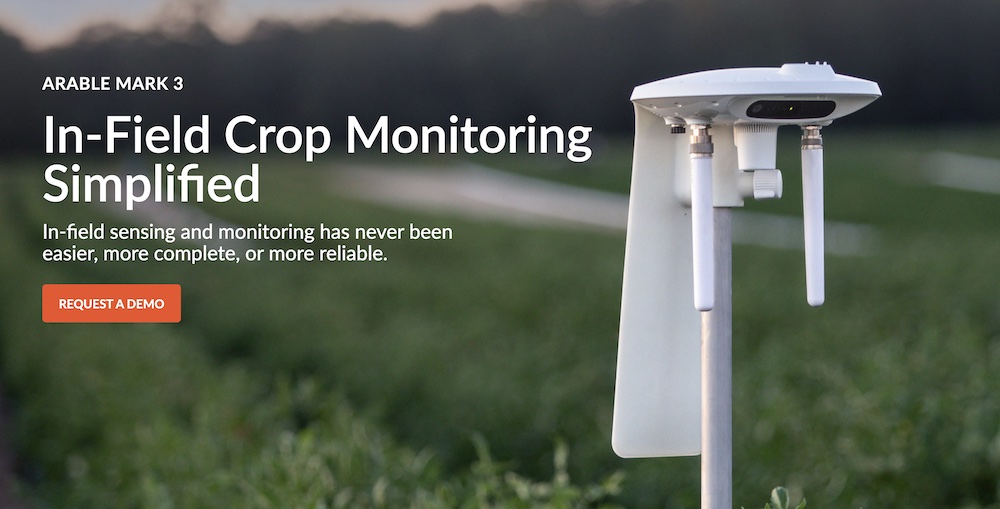
Arable.com uses clear, concise CTAs that pop on their web site pages
In the hyper-competitive B2B software world, there is the constant struggle to attract and retain customers and present your products and services. While the seduction of making your web site flashy and attractive exists, the more successful companies will elect to adopt web design that is a clean, uncluttered aesthetic paired with distinct calls to action (CTAs).
The Essence of Clean and Uncluttered Web Design
Clean and uncluttered web design is all about simplicity, user-friendliness, and focus. It eradicates unnecessary elements, leverages white space, employs cohesive color schemes, and emphasizes clear navigation. This design philosophy prioritizes user experience (UX), ensuring that visitors can effortlessly interact with the website and find the information they seek.
Distinct Calls to Action: The Navigational North Star
Distinct CTAs serve as the guiding stars leading visitors towards desired actions, whether it’s making a purchase, initiating a demo, signing up for a newsletter, or downloading a resource. Clear, concise, and compelling CTAs are pivotal, acting as signposts that navigate users through the conversion funnel with ease and efficiency.
The Symbiotic Relationship: Clean Design Meets Clear CTAs
When clean web design joins forces with distinct CTAs, a harmonious user-centric environment is born. Here’s how this symbiotic relationship boosts conversions:
- Enhanced User Experience: A clutter-free design facilitates smoother navigation and faster loading times, creating a pleasant browsing experience. This positive first impression fosters trust and satisfaction and subtly encourages users to respond to CTAs to engage.
- Reduced Cognitive Load: By eliminating unnecessary elements, clean design reduces the cognitive load on users. This focused environment allows visitors to effortlessly process information and make decisions, increasing the likelihood of responding to CTAs and converting.
- Spotlight on CTAs: Uncluttered design puts the spotlight squarely on CTAs. With fewer distractions, users can easily identify and comprehend the desired actions, leading to higher click-through rates and conversions. [Further reading – ‘squint test design philosphy‘]
- Mobile Responsiveness: Clean design naturally adapts to various screen sizes, ensuring a seamless experience across devices. With mobile users representing a significant portion of web traffic, this adaptability is crucial for capturing a wider audience and driving conversions.
Designing for Converting Demand
In the competitive B2B software landscape, businesses must craft online experiences that not only resonate with users, BUT drive action. Clean, uncluttered web design, complemented by distinct CTAs, is the absolute essential strategy to enhance user experience, reduce cognitive load, and highlight desired actions. By embracing this approach, B2B companies can not only increase conversions but also build lasting relationships with their audience, paving the way for sustained success.
We will continue exploring this topic by looking at specific success stories where clean design is married to clear CTAs which allows companies to convert demand.
- Note – We use ‘CTA’ often in this post which you can find in our ever growing TLA Orama (three letter acronym) page.